Back to home
Closing the gap between approval and activation in the bank-linking step.

The goal
Signing up for Invoice2go's online payments feature is a two-step process: register with your business details, then link a bank account so payments have somewhere to land. A significant share of customers were dropping off at step 2, never actually completing the bank-link that made online payments usable.
That drop-off was a direct business problem, not just a UX one because every completed sign-up is ongoing payment-processing revenue, and it's also what unlocks the benefits that make the product stickier day to day (fast payment clearing, auto-matched invoices, real-time status). None of that reached customers stuck at step 2.
I led the investigation into why customers were dropping off at that step, and designed the fixes that closed the gap by working closely with the product owner and engineering manager throughout.
Findings
The UX researcher and I ran 8 interviews with current customers who hadn't linked their bank account, to understand where they got stuck and why they hesitated. Three things came out of it:
Some customers believed sign-up was already finished once they'd submitted their registration form. Bank-linking read as an optional extra step, not something required to actually use the product.
Trust issues arose around our partner vendor, who processed the card payments.
Not every bank was available on our partner's portal, so some customers couldn't link their account at all.
In the existing design, the empty state carried the headline "Link your bank account using Plaid," followed by a description explaining that this step was required to accept card payments. Despite that content being present, many users skimmed past the description and never registered why they needed to link a bank account at all. The headline told them what to do, not why, so anyone who already thought they were done had no reason to stop and read further.
Of the users who did proceed, many hadn't actually registered who Plaid was before being redirected and once they landed on Plaid's portal, there was no Invoice2go branding anywhere on the page. From the user's perspective, they'd been handed off to a completely unfamiliar site and were now being asked to enter their bank login details there. That alone was enough to make a lot of people stop and back out rather than continue.
For the users who did get as far as Plaid, a separate problem showed up: linking a bank account meant selecting it from a list Plaid supported. If a customer's bank wasn't on that list, there was no way to proceed at all.
Solution
Lead with the value proposition, not the mechanism
The original headline described the mechanism ("Link your bank account using Plaid"), not the reason a user would want to do it, which meant customers who assumed sign-up was already finished had nothing telling them otherwise. I rewrote it to centre the thing customers actually cared about — getting paid: "To receive payouts, link a bank account."
I also rewrote the supporting copy to walk customers through what the linking process would actually involve, rather than the previous version, which abruptly redirected them to a login screen with no warning.

Build trust by naming the partner and explaining the handoff
Plaid is our vendor for payment processing, we hand them the bank-linking step, and they manage the actual connection and payments on our behalf. I worked closely with our developers to understand what was and wasn't possible within Plaid's API before proposing anything. My first idea was to put Invoice2go's own branding directly on Plaid's bank-connection screens, so the flow would feel like part of our product rather than a handoff to somewhere else but that wasn't something Plaid's API supported at the time.
With that ruled out, the strategy became educating the user before the handoff instead of inside it. This included an interstitial screen, shown right before the redirect, explicitly naming Invoice2go's use of Plaid and reassuring users their data remained their own. Without that context, people were dropping off at exactly the point they were asked for sensitive banking details by a source they didn't recognise.

Give users a path when their bank wasn't supported
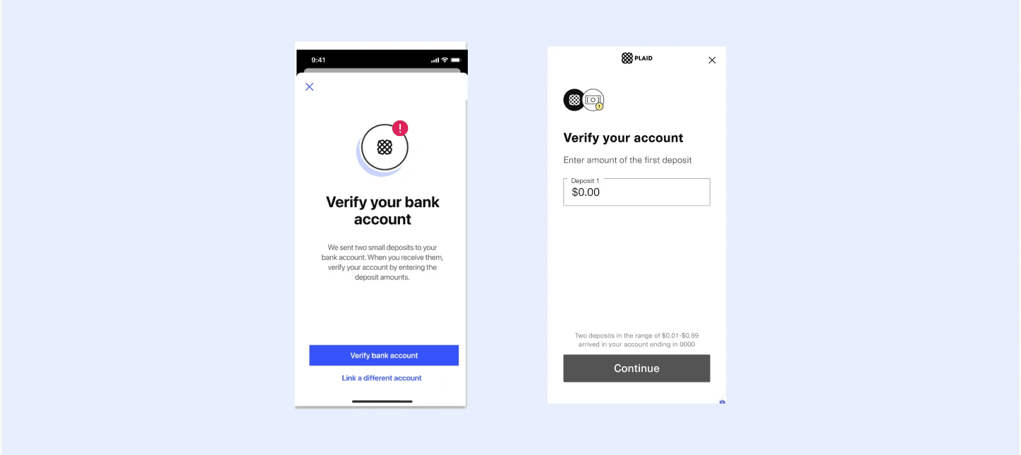
Plaid could only facilitate account linking for banks already in their system, which left customers on unsupported banks unable to proceed at all. I drafted designs for a manual alternative and took them to Plaid directly. Since they're the vendor actually managing the bank connections, their technical constraints shaped what was possible. Working closely with engineering and our PM, we landed on a middle ground between the ideal user experience and what Plaid could feasibly support: customers could link an account by entering routing and account numbers, then verify ownership via micro-deposits. I designed the screens for that manual path based off Plaid's API.
Results
After release, I tracked the data to check the solution actually worked. The metric that mattered was the share of the entire user base signed up for online payments. Not just people who'd completed registration and approval, but everyone on the product, including the users who'd never engaged with the flow at all. That stood at roughly 50% before this work, and had climbed to around 60% within a few months of the changes shipping.